CampGem
Housing Rental Website

Duration
-
3 months
My Role
-
UX/UI designer
Deliverables
-
Website design final version
-
User flow
-
Information architecture (IA)
-
Wireframes
-
High-Fi Mockups
-
Design systems
Introduction
Provide an informative but easy-to-use housing rental website to both renters and landlords
CampGem is a housing rental platform that not only can tenants rent, but everyone can be a landlord to add their properties for rent.
All the transactions will be completed on the CampGem website at once, including adding properties, applying rentals, signing on contract, and doing the payment.
Tenants and landlords have separate account management systems to manage related information.

When I took on this project, the website already had a basic user flow, and my clients wanted me to redesign the CampGem housing rental website.
I'm curious about the purpose of their goals to redesign the site, which could also help me to design in the right way.
Business Goals of CampGem
-
Pay more attention to the landlord side, making them feel easy to add properties for rent. Thus attracting more users to the CampGem
-
As the platform offers a wide variety of rental types, hope tenants can quickly find the housing they need
"Keep business goals in mind to analyze CampGem website!"
Problem Statement

Project Goals

Redesign The User Flow
Unlike most housing rental platforms, CampGem provides various rent types for the tenant, breakdown into single units and multiple units of one property with entire and shared rent.
User flow of 4 rental types: Single unit for entire rent, Single unit for shared rent, Multiple units for entire rent, and Multiple units for shared rent.

1. User flow of exploring various rental types
Design Challenge - How can I let users explore various rental types with fewer clicks?
Current Situation
-
Tenants need to click up to 3 times to find a specific shared rent room, which hides too deep
-
The content hierarchy was disordered, which made users feel confused
Goals
-
Consider the user flow for each of the four rental types
-
I need to show different rental types more straightforwardly, letting users explore complex rental situations in an easy-understanding way with fewer clicks
Design Solution
-
Keep the user flow of exploring rental types flatter by multiple-level expanding design
To minimize the need for clicking and navigating between pages, I have opted to implement a multi-level expanding feature. This allows users to have multiple sections open simultaneously on a single page.
This approach offers greater flexibility, enabling users to easily compare different rental types and quickly find a specific rented room.
-
Redesign housing information display
It becomes neater so that users can find the most important information first.


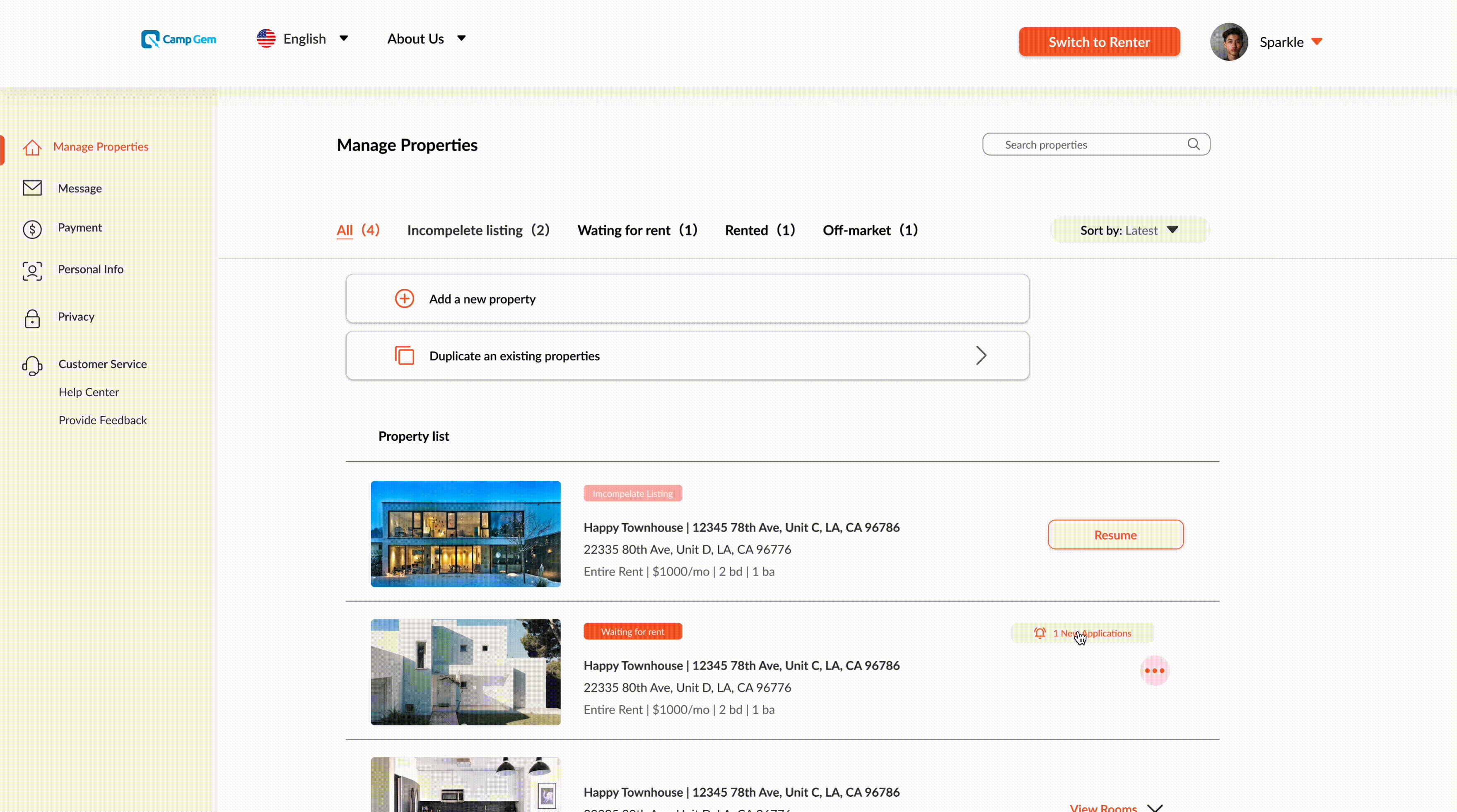
2. User flow of adding a property
Design Challenge - How to provide a clear and straightforward way to encourage landlords to upload property information for rent?
Current Situation
-
Only one page for the landlord to add property information, which is overloaded
-
Add a property process for different rental situations mixed together, making the process more complicated
-
The rental information to be filled in is confusingly categorized
Goals
-
Redesign a more logical and easy-to-understand user flow of adding a property to the landlord's side
-
Reclassify the rental information that needs to be filled in for this process
Design Solution
Let the landlord add a property step by step
Avoid showing lots of content at once on one page to make the landlord feel overwhelmed. I decided to divide all the information that the landlord needs to fill into several pages. Each page presents a few questions under a specific section, such as property info, rental requirements, and upload media.
The landlord just follows the " Add a property" flow to fill in rental information step by step, which is simpler and more logical for the landlord to follow.


Restructure information architecture (IA)
Current Situation
-
Consolidated all features for tenants and landlords into one account system. This was confusing to users, regardless of whether they were tenants or landlords.
-
The incorrect labeling of content in account systems, such as "My Apply", "My orders", "My collect", and "My resource", can be confusing in terms of their meaning.
Goals
-
Restructure the account system, creating two separate account management, one is for the tenant, another one is for the landlord.
-
Reorganize labeling to navigate users clearly while they manage accounts
Design Solution
Distinguishing between the information required by renters and landlord
Sorting information from both sides helped me understand and restructure the information architecture for the account system.
Based on previous research conducted by CampGem's UX researcher, it was found that most tenants prioritize a seamless application process, easy payment methods for rent and additional fees, and the ability to contact the landlord at any time. Additionally, tenants would like to have the option to save listings they are interested in.
As for landlords, they also value a streamlined application process. Additionally, landlords hope to have convenient management of rental listings.

Restructure Site Map


Animated Prototype

Visual Design Highlights
I also took on the responsibility of rebranding the CampGem website with designers from the mobile team. Together, we decided on brand colors and fonts.
Afterwards, I redesigned the entire website and created the design system. It was a lot of fun! It was my first time starting a project from scratch!


Reflection
For the informative website, strong logic IA and user flow could make users feel easier to take action on the website
Nowadays, to provide more options to users, many websites would like to present and show lots of information. My clients do the same. When I went through CampGem and discussed with clients, they said they want to give more opportunities for tenants and landlords to various rental types. So how to structure this information and design an easier way for users to use are the biggest problems for me.
According to the previous design of CampGem, users need to jump to several pages to view the room they want to rent, which makes users far away from some main content from previous pages and get lost easily. It's hard for them to compare listings directly as well. However, expanding the design could solve this problem. To be specific, the website can collapse some content at first so that users can expand the additional information when they needed on one page without jumping to another page. So users can view content as much as possible at once, including main content and secondary content, which is easier for users to follow "where they are" on the website.


