SensiWatch
Email Notification

Duration
-
May–December 2024
My Role
-
Research&Product Design Intern
Team
-
U.X. Team
Introduction
All my skills leveled up throughout this Product Research & Design Internship
This was my second Product Design internship, where I applied my previous experience to help the Sensitech UX Design team deliver features based on their roadmap while continuing to learn new skills and grow professionally.
Thanks to my team, users, co-workers, and stakeholders for supporting my internship project—an intensive six-month endeavor. I delivered a brand new version of Email Notification that received 100% positive feedback from users, PM and stakeholders.
This helped clarify the 2025 Roadmap and enabled the team to gain deeper insights into both UX and UI aspects of the Email Notification feature and the SensiWatch Platform. I also enjoyed every minute working with talented people at Sensitech and learned far more than I expected!


Project Context
SensiWatch platform(SWP) and Email Notification feature
SensiWatch is one of the main products from Sensitech, which is designed to display, monitor, and manage data from Sensitech physical monitors.
It allows our customers to track their shipments in real-time and ensure their products maintain good quality during shipping.
Email Notification is the #1 feature and functionality of SensiWatch Platform (SWP), sending automated alerts to customers when specific events occur. As my main internship project, I was tasked with improving and redesigning Email Notification by understanding customer pain points/problems and enhancing user engagement.

Current Situation
📄 Basic Product Requirements - Phase 1
-
Since Email Notification is the No. 1 feature of SensiWatch Platform (SWP), improving its user experience and engagement is crucial, as it helps customers efficiently handle shipment problems.
-
We heard some customers were not satisfied with the Email Notification due to its length and inefficient functionality
-
I was assigned to this project in its early stages, with only basic product requirements as a starting point
-
Reduce white space
-
Cut down content to 1 page
-
👩🏻🎨 Questions that came to my mind
More research is needed to understand reasons and things for improvement.
-
Why do customers want a short version?
-
What are the most important content/information shown in Email Notification that help customer better drive their day-to-day tasks?
-
How can I improve Email Notification to improve engagement based on product requirements?

Final Designs
The enhancement of Email Notifications isn't solely focused on redesigning the UI. It also involves improving features and addressing user needs to enhance the overall UX.
To better accommodate various user scenarios and boost efficiency, instead of only providing one version of Email Notification in general, two distinct versions of Email Notifications have been developed as the final outcome.
The final designs received 100% positive feedback from usability testing and team design critique, and were also approved by PM. These will be launched in Q1 2025 according to the roadmap planning.
Final improvements:
-
Offer a brief and concise version that highlights only the most valuable data points to enhance user efficiency.
-
Retain the detailed full version for users requiring complete information, but redesign it for a more compact format that reduces white space by nearly half compared to the original design.
-
Changed UI to be more compact by utilizing the Design System

Design Process

Discover & Define
Exposed more user needs in user interview
Users are always my key to identifying problems by empathizing with them. I invited 8 users who utilize Email Notifications daily and gathered feedback from other external users to my user interview sessions.
We explored and discussed specific questions to uncover the issues they face with Email Notifications, identifying which problems are the most urgent and which are must-haves.
After analyzing interview data, there were many parts that needed to be improved. I defined user problems and developed project priorities to help the PM with roadmap planning and clarify my next steps:
🤔 Problems
-
The Email Notification is very long and unable to quickly understand the situation of monitor trip
-
Lack of PDF download options to share or save email notifications or monitor trip information
-
Blank fields caused space without value to users
-
Data/information shown on the Map and Multigraph are not good and clear enough
-
Contain excessive content, with some information being irrelevant for different user groups
⬇️ Prioritization
P1 - Redesign and enhance notification page functionality
P2 - PDF Attachment/Add PDF download option (SWP)
P3 - Provide Blank Field Hide Option
p4 - Improve Map and Multigraph
p5 - Enhance email notification content control and display options


Design
Current Email Notification is very long and unable to quickly understand the situation of monitor trip
My primary focus, based on my research findings and summaries along with the roadmap plan, is to redesign the Email Notification page to enhance its efficiency, with a launch scheduled for Q1 2025.
Besides the user needs I found from my research, I still need to consider constraints and requirements from the PM and design team before entering the design stage.
Design Challenge
Our design team to retain the existing information in Email Notifications, despite its abundance. This has constrained me to streamline the page as much as, considering:
-
How can I effectively use the information we already have to create a concise version?
-
How can I better cater to the varying needs of different user for Email Notifications?
Design Solution
I suggested that we offer two versions of the Email Notification: a Summary Version and a Full Version. This approach better aligns with user needs also maintaining our existing features.

Summary Version Design is the first thing that needs to be designed
The summary version is a new page that must be well-designed to meet all requirements. It will serve as a reference for aligning with the full version. Therefore, I focused on creating the summary version first and then updated the full version based on its design.

Feedback and Iterations
The new functionality has been approved, but the UI requires enhancement
My initial design for the Email Notification served as the foundation for gathering feedback and iterating on the designs multiple times, incorporating numerous minor adjustments and three major revisions.
I presented this first version to several users and the PM to receive initial feedback on functionality, content, and information architecture generally.


Implementing card design in Email Notifications is a good starting point
I also showed my version 2 to confirm with PM and ensure it's the best version for usability testing. The interesting thing was PM told me she's thinking of implementing more card design on SWP, which is the design trend for dashboard design. Email Notification would be a good starting point to implement more card design as reference for SWP.
Since card design implementation will require more effort from both the design team and tech side, we have some concerns about having card design, even though the team and I feel it's a good design concept for users. But we don't know how users feel about it, or if it's worth implementing at this point.
So I decided to design the card version, testing both card design and table design, learning from my users.


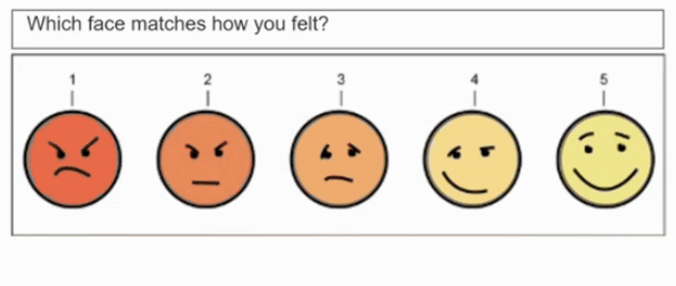
Usability Testing and Iterations
Users indicated that the card design should be the final solution
I conducted 5 usability testing sessions, including group and one-on-one interviews with users to gather feedback on my designs. I analyzed the data to finalize my design solutions and gained insights for future SWP product iterations.

Final Designs

The full version always changes and is followed by the summary version, because the summary version is just a condensed version of the full version. Therefore, they need to be aligned with the same designs.
Next Step
The email notification system needs to be configured on the admin side by the program manager at Sensitech, who can set up either summary or full versions. After completing the email notification designs, I had time to explore admin interface concepts based on user research findings.
The key focus is customization, giving users more control over their email notifications.
The setup process must follow the email notification design logic.
The admin part was not included in the roadmap when I was working here as an intern, which could be considered in the future once the new version of Email Notification is launched.

Admin Design Concept


Impact and Reflection
🤔 Research findings can tell more than we thought
The project began with a simple user pain point: email notifications were too long. While the PM planned improvements, there was no clear roadmap yet.
My research revealed users needed not just shorter notifications, but better efficiency in understanding alarm triggers and required actions. The findings helped prioritize key elements for staged improvements.
After sharing these insights with the team, the PM gained clearer direction and updated the roadmap.
My new Email Notification designs were approved and scheduled for launch in Q2 2025. My research findings helped clarify the roadmap and prioritization of improving email notifications.
📝 Feedback is a double-edged sword
Receiving feedback is a crucial part of the entire design process that helps us improve designs to meet requirements. Sometimes we receive lots of feedback from different people, users, and stakeholders. What I've learned is the importance of analyzing feedback and deciding which suggestions warrant action for improvement, since not all feedback fits the situation we're designing for.
Don't feel pressured to act on every piece of feedback that will only pull you in too many directions and outside the project's scope. Be efficient in how you handle feedback!


